Tuesday, 30 April 2013
Evaluation
These are videos of feedback, these videos show that the audience in which I planned to target was shown through the production of my music magazine, they also show what they find appealing about the magazine and why.
Saturday, 27 April 2013
Evaluation Of Main Task


1.) In what ways does your media product use, develop or challenge forms and conventions of real media products?
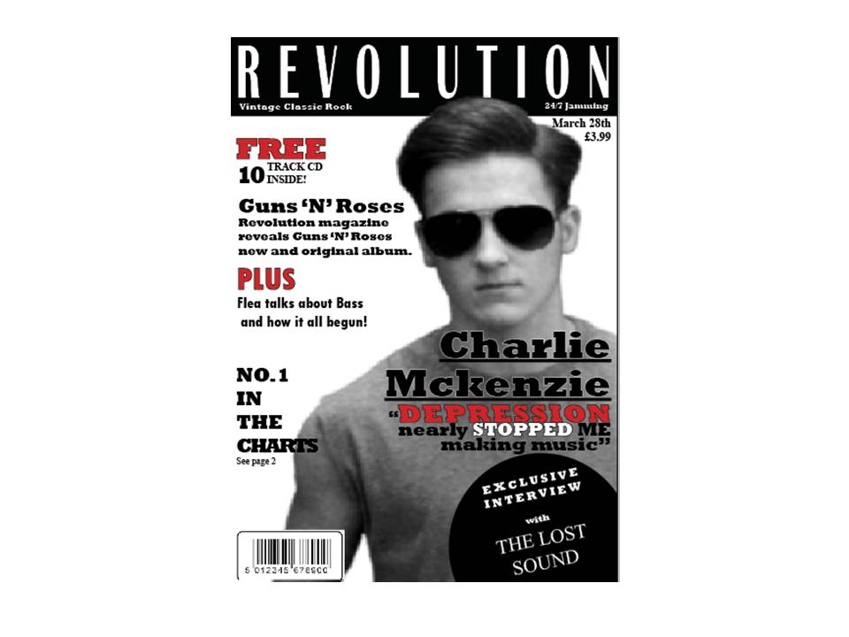
My media product has everything in it which a real media product would have. It has the strong key images, the bright bold font which catches the attention of the public and mainly the information that the fans of my genre magazine would want to read. My magazine has an good title which every magazine will need to keep the public keep buying the issue. It has an clear acceptable price and an code bar which every real media product has. What mainly makes my product have the conventions of a real media product is use the of colours and font. Having a strong key image on each page with similar font colours on each page really helps show what genre the magazine is. On the main page the sub headings, quotes, cover lines and pack shots do really grab the audience to my magazine. Without making these stand out I don't believe my magazine would look any thing like a real media product. So I think using an good font, colour and stroke is essential to grabbing the audience and making your magazine look like an real media product.
2.)How does your media product represent particular social groups?
My media product will interest the audience of rock. But rock comes into many different category Id like to believe that my magazine covers different parts of all the rock. For example there is funk rock, heavy rock, soft rock and hardcore rock. My magazine will attract all the different social groups of these categories. But also not just the rock fans but also anyone interest in celebrities. This magazine has got allot of rock facts and updates but also featuring in the magazine is allot of famous celebrities life's and exclusive gossip. So even if your not a fan of rock you might just be looking for a good read and finding out some new celebrity gossip.
3.)What kind of media institution might distribute your media product and why?
My media product will be sold to all newsagent shops, supermarkets and music shops. The music magazine will also be sold to Apple and Google playstore so the public can download the magazine straight to there phone while on the go. It will be sold to the newsagents shops because it will be a popular issue that people will want to buy and not have to travel far to buy it. It also be sold to supermarkets because over the last 10 years the magazine market has grown by 1 billion pounds. 27% of people will go to the supermarkets or places like WHSmiths just to buy magazines or newspapers. Selling my magazine to these kind of shops will increase orders and subscriptions of the magazine but also widely increase new fans to the rock genre and to the magazine.
4.)Who would be the audience for your media product?
My audience for my magazine will obviously be the rock genre. You can instantly tell by the quotes, names of the bands on the front and the images. Also the magazine will be targeted towards both sexes it isn't just male based or female based. The magazine will be for about 15+ because of the use of language and some of the images. Some of the story lines and or quotes can be quite sad and dark as well so 15+ is appropriate.5.)How did you attract/address your audience?
I think what is key for your magazine is a strong front cover image. Straight away by the clothing, hair and look you can tell what the magazine is going to bed. You got to have the colour scheme to suit different genres like e.g. pink for pop and black and red for rock. I used a very big quote on the front of the main story line in different colours to draw in the attention of the reader. I changed the main words to different colours in the sentence for example the word 'free' was quite important so i made it bolder and changed it to bright red to make it stand out.
6.)What have you learnt about technologies from the process of constructing this product?
For constructing my product I used in design. It was my second time using in design so I familiar using it. This time round using it I had learnt allot more about in design but not also in design but also Photoshop. I had to use Photoshop allot more because i had more images. This time using in design I knew how to do thing instead of not doing them because I didn't understand how to. I used Youtube and help from other students and my teacher to teach me new things on in design and Photoshop I've learnt now that I can visual things and then proceed with making them on in design and making them even better and theirs allot you can do with photoshop and in design. I got to grips with using blogger very well. I now know how to save drafts update contact prints and videos if I need to.
7.)Looking back at your preliminary task, what do you feel you have learnt in the progression from it the full product? (CLICK THE LINK BELOW TO VIEW PREZI)
Question 7-evaluation prezi


These are a few selected images used in my music magazine which was all original photography. I had to book out the study so I could use the green background sheet making it easier to Photoshop I dressed one model in all black and the other with ripped clothed. The models clothing were inspired by Gun N roses. For the original photography I had the stand in numerous positions with different poses. I used an Nikon D3000 and held the camera free hand without an tripod.
Tuesday, 23 April 2013


These are my drafts that I've sketched out for my music magazine. The genre of my magazine which I have researched into is rock. This is a rough copy of what my magazine will look like. This isn't going to look anything like the final product but will give me enough ideas and a good visual of how my magazine will turn out. The colour scheme of my magazine will be basic but effective. The title page and contents page will a black on white theme with a grey and white photo. The contents page on the other hand will be a different colour scheme, a more brighter page with red on black. Each page will have big photos.
Monday, 11 March 2013


Wednesday, 6 March 2013


Thursday, 7 February 2013
In what way does your media product use, develop or challenge form and conventions of real media products?
My media producted has used appropriate material in the magazine. The layout of the magazine I have used have been from other professional magazines to do with school. The topics are appropiate to do with the school. The target audience is obvious towards who it is as it clearly a school magazine towards the school students and parents. I took conventions from the real products like serperating the contents into a 3 column page. I have used appropiate contact details, header details and images.
How does your media product represent particular social groups?
My media products represents the school students of trinity and the parents of the students. Its more informal so it is easier for the students to read but also at the same gives the information that is needed. The contents page gives messages out to all the pupils of the school like the sports department and the children who are into the sports. The other children who are into charity raising and all the school when it comes to the non uniform and days off.
What kind of media institute might distribute your media product and why?
Media institutes like whatschoolnext.co.uk might use the magazine to show parents what kind of school it is. Also to show where the parents what the school looks like and where it is. It also gives them an idea of what the students get up to e.g. clubs to attend and competitions won. Online websites like the local councils might show and promote the school to give it an better reputation.
Who would be the audience for your media product?
My audience would be all the years of the school because the magazine is designed to keep all years up to date with what is going on with the school. The teachers of the school would be updated from the magazine along with the parents. So my main audiences for the media product is the children, teachers and parents.
How did you attract/address your audiences?
To attract the audiences I used information that will be useful to the children and catch their eyes. I used simple language and an easy font to read which was still big enough to get there attention. I used images taken by myself to attract the students to the sub titles in the contents page.
What have you learnt from about the technologies from the process of contributing this product?
For my school magazine I used in design for the first time. I had to teach myself how to use it. I found it alot more tricky and harder than photoshop. I learnt loads about in design I know how to get around the software I know how to make magazines. With the new skills ive learnt about it im sure that now if I was set an task to use in design again I could use it. I used photoshop aswell to edit my photos. Also I used blogger for the first time on this task which Ive found to be easy and nice to use.
Looking back at your preliminary task, what do you feel you have learnt in the progression from it to the full product?
Since the prelim task I have learn that I need to do good research to be able to make an good end result. I need blog more of my research and show the stages off showing my research. Also I need to show approach my teachers twice an week to feed back. Ive learnt that also I should follow the marking scheme more and often look it to feel as if im ticking off the level 4 bullet points. Ive learnt that from prelim task that more thought and work should have gone into the work. Ive learnt that I need to more organised deffiently for next time. I need to organise taking photos and work that is going to go into the work. The prelim task has really been an eye opener to me. It proves to me that I can get the work done but if I put alot more effort in and organisation I could be capable of doing so much better work. The prelim task has taught me so much not only with new software ive used but also on what I need to do better.

Thursday, 31 January 2013


Thursday, 10 January 2013
foundation portfolio for photography

Subscribe to:
Posts (Atom)